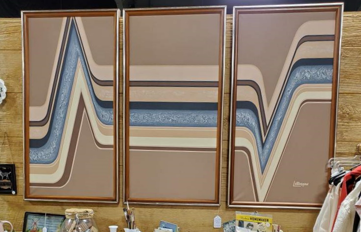
It’s not often you find oil paintings with such a well-defined and readable signature, but the one on this triptych we have in our booth at Fargo Antiques and Repurposed Market is clearly LETTERMAN, stylized with extended letters to evoke modernity and motion.

And, not only is the name so readable, the signature readily identifies a variety of other works from this artist, all large, geometric paintings, all with the same readily-identifiable signature.

Don’t try to find “Letterman”, though: this isn’t an artist’s signature, it’s the name of a line of high-end decorator art sold in department stores, particularly JC Penney’s, during the 1970s, sourced and distributed by Artmaster Studios of California. A few are attributed to an Antoinette Letterman but I believe these are misattribution to the wrong “Letterman”; Antoinette’s signature looks less like a logo and more like a human signature from the examples I can find.

The paintings, all done with quality higher than the usual starving artist works you find prescribed by interior designers, appear to be unique, even if there are similarities in styles. Paintings range from very geometric to realistic photos of animals. They mostly share a common palette, primarily browns and yellows and neutral colors.

Unlike a lot of decorator art, the unique and stylized art produced under the Letterman logo demand a high price today. Collectors recognize the uniqueness of the style, and are willing to pay high prices for these rare works of art.

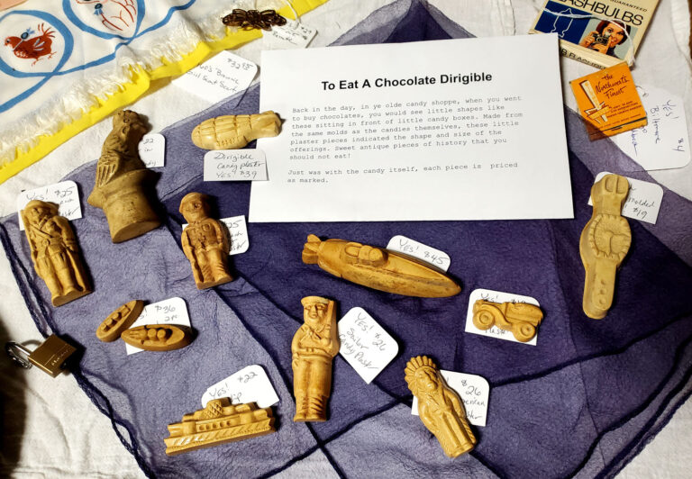
Back in the day, in ye olde candy shoppe, when you went to buy chocolates, you would see little shapes like these sitting in front of little candy boxes.

antique plaster chocolate candy shapes

Made from the same molds as the candies themselves, these little plaster pieces indicated the shape and size of the offerings.

One imagines such visual depictions also helped when a customer didn’t speak the same language as the candy seller. “Dirigible” is difficult enough to say in English – I don’t want to think about trying to buy a chocolate dirigible from an Irish chocolatier! 

Sweet antique pieces of history that you should not eat!

antique plaster chocolate molds

Available for purchase – located in our space at Fargo Antiques & Repurposed Market, booth #1 in the “twig” case.

chocolate dirigible candy molds of plaster
Tagged with: , , , , , , ,

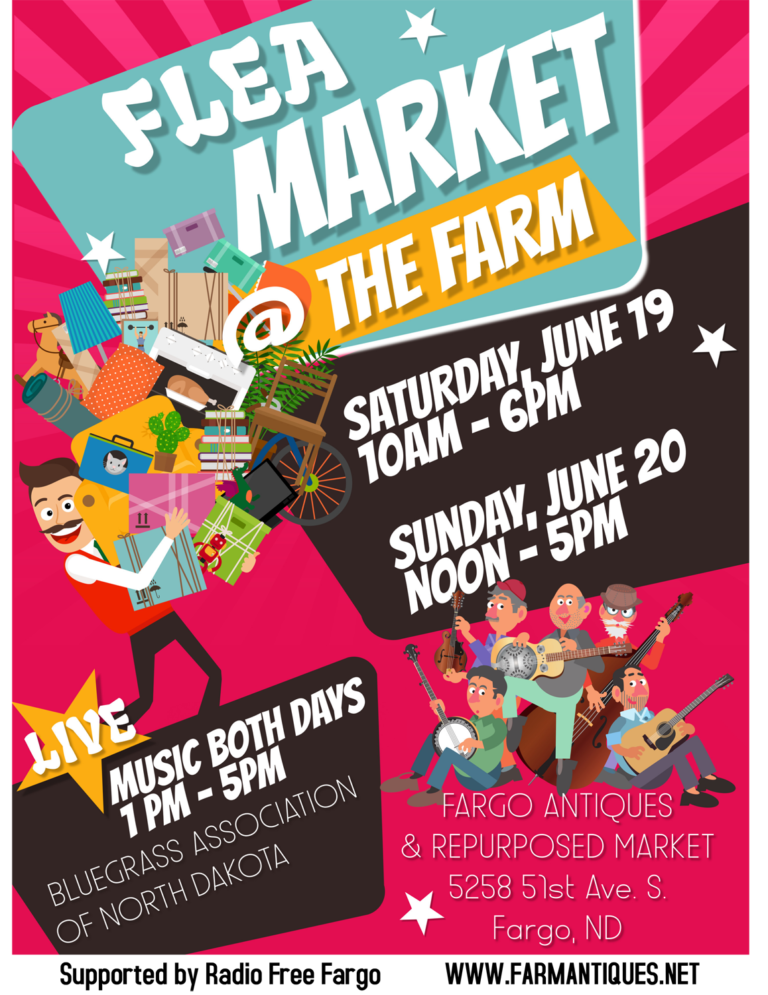
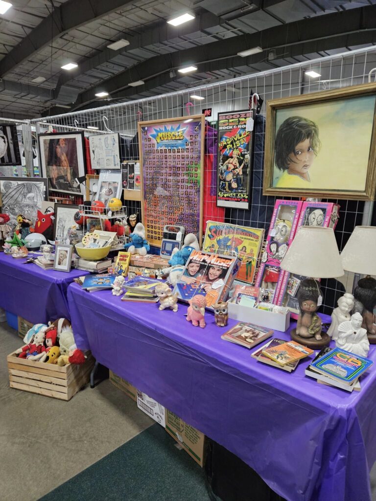
It’s time for the annual June flea market at Fargo Antiques & Repurposed Market!

That means, along with all the dealers, we will be having sales inside. Our YES booths,#25-27, will be 20% off. And the LunaTique Art Gallery, Occult, & Oddities space, code ART in booth #55, will be 10% off.

We also will have a booth outside in the parking lot too – right next to the live musical entertainment!

Yes, live music at The FARM!

The Bluegrass Association of North Dakota (B.A.N.D.) will be performing live jam sessions on Saturday and Sunday from 1 pm until 5 pm. So there literally will be pickin’ & grinnin’!

To promote the event, we will be live on the air with Travis of Radio Free Fargo – on his “This Side Of Country” show.  That will be this Friday, June 18th, starting at 11 am with members of B.A.N.D. Details here – please listen in. And do share!

The dates of the flea market are:

Saturday, June 19th, from 10 am until 6 pm.

&

Sunday, June 20th, from noon until 6 pm.

See you at The FARM!

Tagged with: , , , , , , , , ,

Part of my job as an antiques dealer (or vintage seller, if you prefer) is to properly clean, research, and identify reclaimed and discovered items in order to best present these old things to potential buyers. Continually making discoveries, uncovering new-to-me stories is one of my favorite parts of this gig.

But sometimes, as I’ve recently noted on Twitter, I go down rabbit holes and end up writing tomes when I list the item. It may not always translate into the best bang for my buck – especially when I fall in love with something which should just be inventory…

Meet my latest crush: Cecil Aldano Moore

More than just a handsome big bear of a man in an impressive fur parka, Cecil A. Moore, aka Mush Moore, was most known for his sensational 6000-mile trek by dog-sled across the US.

He left Fairbanks, Alaska on November 14, 1949, and arrived on April 4, 1951 in Lewiston, Maine (where Moore was from *).

Moore used a sled custom-built and donated by the Flexible Flyer sled company. (The sled had wheels that could be installed when it was necessary to traverse snowless trails or roads.)

The parka Moore wore was worth thousands of dollars; it was made by an Eskimo woman, the finest fur maker in Alaska.

But it was still a rough trip…

Five days in, members of the U.S. Army in Alaska came to look at the sensational dog team ad musher. “The temperature was 55 below zero that day and the officers and GIs marveled that the hardy Moore could survive alone in that frozen waste.”

Traveling roughly 35 miles per day, Mush Moore & his dogs crossed five mountain ranges, 81 lakes, and 129 rivers. And that’s not including the other treacherous & perilous incidents.

Moore finished the trek with nine of the 12 original huskies he started with. And Mush always gave the dogs all the credit for his remarkable trip which made headlines all across the country as he traveled from coast to coast.

Cecil Aldano Moore also worked as an ironworker in many states as well as Morocco, Iceland, & Africa. He was the lead foreman on the Augusta Memorial Bridge, Augusta, ME, which was the largest bridge in span and height at the time of construction.

Arch Soutar, Lewiston Evening Journal editor, who interviewed Mush often, recalled that Moore was “unusually strong, physically resourceful and an enemy of defeat, engaged in a rough and hazardous profession,” adding that Moore “was a man of unexpected inner sensitivity, an outdoor man with a large and almost brilliant vocabulary.”

A larger-than-life man. Yet a man largely lost to history.

(I know I shouldn’t be surprised; no one lives forever, not even film stars with such dreams of living forever on celluloid.)

This rare vintage dog-sledding and sporting history find is currently available for purchase on Etsy. Contact us with serious inquiries.

Clearly designed for fans who followed the amazing trek & came to see him when he stopped in their towns and cities to take care of his dogs, this promotional piece has Cecil A. Moore’s signature printed along the photograph on the front. However, the real Mush Moore signature is inked on back.

This piece of ephemera is akin to the thin cardboard of Mutoscope and old Hollywood movie promo cards. It measures 4 x 6 inches.

* Funds raised from this marvelous event created the Cecil A. Moore Fund for Underprivileged Children at the Healy Asylum in Lewiston (Healy Asylum was built in 1893 as an orphanage for boys, a role it served until about 1970. Now the building is called Healy Terrace; it’s used for affordable senior housing.

PS The podcast will resume soon! (As soon as I can refrain from so many rabbit holes!)

Why Cecil Mush Moore Made The Trek
Tagged with: , , , , , , , ,

(If you prefer, you can listen to this as a podcast! Smells Like Grandma, episode 1 – 5.)

A few weeks ago I spent the weekend washing out old perfume bottles. Well, technically, washing vintage & retro figural eau de cologne bottles – because perfume rarely comes in such bottles. Which is why most of us refer to such bottles as “fragrance bottles,” but collectors consider the category to be “perfume bottles,” a subset of vanity collectibles, or “collectible bottles”, a subset of “decorative collectibles.” But I digress.

I was washing old fragrance bottles. The majority of these were Avon bottles – primarily the figurative types. And perhaps it was the strong smells from the near 100 different bottled grandma scents, but I started giggling.

At the risk of further digression, I feel the need to address a few other things before I completely offend a great number of Avon ladies & Avon fans.

I’ve been an Avon Lady – not once, but twice, including after having reached one of the highest points in the beauty products game by working for Estee Lauder. So I’m not knocking Avon.

Not only is Avon the oldest beauty company in the United States, with a long history of economically empowering women, but Avon has for decades been the #1 fragrance-cosmetic company in the US with high rankings worldwide. Not so much #1 recently (which is a longer story about marketing and changing markets – and corporate buy-outs), but Avon still ranks in the top 10-15 worldwide every year. This means lots more people than grandmas are wearing Avon. But the nickname still holds – as we shall see.

In any case, there’s a whole lot of Avon bottles circulating. And being collected.

While most collector pros will focus on the obvious things (condition, condition, condition – the importance of boxes, true limited runs, fan favorites, etc.), in this podcast we like to talk about objects in context. In this case, the objects are vintage & reto Avon bottles, and the context of “grandma scents” is also a nostalgic nod to scents of the past.

According to science, smell and memory are linked. Dr. Alan Hirsch, founder of the Smell & Taste Treatment and Research Foundation in Chicago, says, “The quickest way to affect somebody’s moods or behavior, quicker than with any other sensory modality, is with smell.” So collecting perfume bottles, Avon or not, is closely linked to memory.

Vintage scents may link you to your grandma, yes. Maybe it’s a scent she wore. My grandma wore Avon’s Charisma for special occasions, so it’s part of Christmas for me. But vintage perfume scents may remind you of your grandma, or grandmas in general, at least in part, because most fragrances tend to go bad & get that funky old smell after 3-5 years – and who doesn’t have a grandma who has old fragrance bottles getting dusty on her dresser? (Hence all the washing I’ve been doing!)

Or the scents may link you to your own past – a special occasion, your first big girl perfume, your first kiss – your own teen spirit, if you will. Meaning you might now be the “grandma” part of “grandma scent.”

But another part of the context of collectible Avon bottles is the heading-toward-us-like-a-bullet-train holiday season.

As I found in my sink, there is a ton of evidence of the gift-giving of Avon. Perhaps none as obvious as the array of men’s fragrance decanters.

There are a ton of cars, which may seem gifty enough for the generic men in your life. I mean, I guess glass cars look cool… I tend to like the kitschy stuff, including white poodle Avon decanters, so who am I to judge?

But there’s more. Including a plethora of men’s footwear options…

So.

Many.

Boots.

As a woman who used to sell men’s shoes, let me tell you there is nothing – & I mean nothing – like the odor of a teenaged boy’s feet. You learn in the shoe business to inhale deeply before you even begin to bend toward the feet – slowly exhaling as you go, so that you will not need to inhale again before you have exited the danger zone. You also learn to smile with commiseration with any mothers about – because they know what you are going through and are suffering in mortified silence as well.

So anyway, the notion of selling any fragrance in footwear form is, well, it just doesn’t smell right. Yet Avon has more variations of boot cologne bottles than seems possible.

Not that Avon figural bottles are necessarily shaped like scents. For example, the car decanters don’t smell like car exhaust or those cardboard trees. The 12-inch tall grandfather clock Avon bottle doesn’t smell like… clock. Nor does the spool of thread with thimble cap portend of a specific olfactory delight. In fact, most of Avon’s figural decanters seem perplexing to those of us who understand the marketing of fragrance… But still, men’s boots do suggest unpleasant scents. So I wrinkle my nose.

Perhaps my favorite – and by favorite, I mean most giggle-worthy – Avon men’s figural fragrance bottle is the weather vane – cupola combo.

In case you aren’t familiar with a cupola, it’s a small structure on the top of a building. They were used as lookouts, or to hold a bell or clock. Today, these small clocktowers typically provide ventilation or are purely decorative, perhaps holding up a weather vane. Just like this Avon bottle of aftershave. A decorative barn-red cupola topped with a black horse weather vane. “Thanks for thinking of me, grandma!”

Oddly enough, the weather vane – cupola combo container holds Deep Woods or Wild Country aftershave. And neither of those cologne names – i.e. the scent fantasy of a rugged outdoorsman who can’t be tamed – sounds like it belongs to a dude who wants to be domesticated by a farmhouse decor style.

This bottle does, however, lend itself to a gift-seeking grandma or & aunty who doesn’t know what to get a gent over the age of say 12.

Clearly, Avon has banked a lot of bucks from grandmas… But I think most folks would prefer the traditional $5 in a greeting card.

Feel free to share this with a grandma.

This Week's Story Avon Podcast Fargo Fair Oaks Antiques
Tagged with: , , , , , , , , , , ,

Hi, I’m Deanna Dahlsad of Fair Oaks Antiques, here with This Week’s Story, and I am a paint by number collector. (If you’d prefer, you can listen to the podcast here.)

Deanna Dahlsad paint by number collection
This Week's Story podcast paint by numbers
vintage paint by numbers dahlsad

Many mock paint by number paintings, saying the works are kitsch – meaning they are of poor taste. Even those who love kitsch in an ironic or humorous way may discount paint by numbers by saying they are not art, they are conformism. But knowledgeable collectors of PBNs, like myself, know that these works are important cultural icons – and anything but conformism.

The mere popularity of paint by numbers is a very American thing. Inspired by childhood memories of coloring and the art history lesson of Michelangelo assigning his students to paint pre-numbered sections of his famous Sistine Chapel, paint by numbers hold significant places in both mass merchandising commerce and the freedom of anti-establishism.

The matter of paint by number paintings being art — or, rather, not being art — wasn’t really an issue in the 50′s. Recreation specialists & home economists had begun to speak of hobbies as more than a way to beat the unemployed Depression-era-nothing-to-do-blues, more than a way to improve morale, but as “the fifth freedom,” along with freedom of speech and worship and freedom from want and fear. The prevailing wisdom of the postwar period was that creative hobbies enhanced life and made it worth living, prompting popular celebrities like Frank Sinatra & Dinah Shore to paint as a pastime. With “Sunday painters” like President Eisenhower and Winston Churchill, even the military had adopted this mindset, setting up hobby craft shops in the Pacific Theater and opening the first hobby craft shop at the Alameda Naval Air Station in California.

In 1952, an amateur painter in San Francisco entered and won third place at an art competition with one of Craft Master’s kits. Both the press and the public had a field day noting how judges could not tell the difference between a paint by number work and Modern Art — an art style in its hey-day, but one many people at the time were confused by &/or fed up with.

This was the tipping point for paint by numbers. They became so popular that The White House even hung paint-by-number paintings by J. Edgar Hoover, Nelson Rockefeller and others in a West Wing corridor along with other artists’ original works.

Karal Ann Marling, Professor of Art History and American Studies at the University of Minnesota, has written several books about the sensibilities of the 1950s. In her book, As Seen on TV: The Visual Culture of Everyday Life in the 1950s, Marling paints the PBN trend as an outgrowth of World War II hobby-ism rather than a sign of conformity:

National surveys taken in the 1930s, when the Depression curtailed spending on equipment and travel, disclosed a sedentary pattern of recreation: respondents were reading magazines and listening to the radio and visiting with friends. What they really wanted to do, however, was to play tennis and golf, plant a garden, go swimming or skating. In the 1940s, wish became reality. Between 1947 and 1953, revenues for spectator sports and amusements showed a marked dip, despite increases in population and income and the insatiable demand for TV sets. …Market research proved that it was the heaviest TV-watchers who were liable to be most interested in painting a still life or reupholstering the living room sofa. Power tools and other do-it-yourself accessories were a $12 billion industry by the end of the decade; $30 million more went for amateur art supplies. “There seems to be a major trend away from passive, crowd amusements toward active pursuits that people can carry on independently,” concluded a highly regarded study of this “Changed America” with plenty of time on its hands.

More than other pastimes which grew during this time, the do-it-yourself spirit was also a way for man, woman, and child to find his or her way in this new world. It was non-conformist:

Do-it-yourselfism, in particular, was the last refuge for the exercise of control and competence in a world run by the bosses and the bureaucrats. It was a throwback, a rebuke to a buy-it-in-a-box world of TV dinners and ready-made everything.

As Michael Kimmelman wrote in 1994 is Art View for The New York Times (Painting by Numbers: How Bad Was It?), “Paint-by-numbers enthusiasts and Abstract Expressionists alike were affected by the same 50′s Zeitgeist: the tension between social strictures and personal freedom.”

Painting now could be an enjoyable pastime, a therapeutic outlet; not only reserved for the trained and talented.

However, painting by a kit was a very American idea.

Marling says paint by numbers were, “the most American thing you can imagine in that you package up everything you need in a box instead of going through lengthy instruction in how to paint or how to mix colors. It was a personal experience for the painter.” She continued, “You could almost call it supermarket Freudianism.”

While some object to the stamped boards of sameness which are to be painted according to ordained rules, we PBN collectors know that many did paint outside the lines, adding images, painting over what they didn’t like, or otherwise personalizing their works. And even when folks didn’t, they still produced unique folk art pieces. The kits may have been mass-produced, but individuals created each painted piece.

Many say that the paint by number hey-day is long over. Yet the kits continue to be painted — and continue to be made. Some may say this is primarily the pastime of children, but one needn’t look any further than the adult coloring book phenomenon to see that adults enjoy creative outlets too. It’s obvious in the popularity of shows like NBC’s Making It and entire cable channels dedicated to DIY programming.

Thanks to the current pandemic, crafting has exploded. The Smithsonian, which had an exhibit on paint by numbers in 2001, noted that the lockdowns have resulted in hands-on hobbies gaining traction as relaxing alternatives to screen-heavy activities. Etsy, arguably the world’s largest e-commerce website for craft supplies, handmade items (& vintage), has documented the uptick in the DIY trend. In May of this year, Etsy said that there had been a 346% increase in searches on Etsy for “diy”, a whopping 956% increase in searches for “embroidery kit”. Huge gains in other specific classic crafty hobbies were seen as well.

Clearly, there are shades of what Marling noted in the 1940s & 50s happening right now.

And there are other similarities as well.

The original paint by number kits consisted of rolled canvas (like window shades) and numbered glass jars containing paint – though they were “mystery” pictures, where the painter only discovered what they were painting only by applying the appointed colors.

If this reminds you of today’s trend of mystery boxes, you are not alone.

Loot Crate is often credited with the mystery box phenom, beginning with its subscription box service in 2012. Since then, it has become clear that it’s human nature to delight in surprises – even when they aren’t your own. One needn’t go any further than the huge number of views on YouTube unboxing videos to see the vicarious entertainment value of simply watching someone open to reveal the contents of a mystery box.

A rather jaded Luke Winkie at Vox says the appeal of mystery boxes is based on how much fun it is to unwrap presents. “Essentially, the mystery-box gambit is a clever trick to fool millennials into paying for a year-round Christmas experience.”

But I say the huge popularity of mystery boxes is proof that you shouldn’t underestimate the power of anticipation, of human curiosity, the love of surprise – or, for that matter, the love of having an experience – not just an object.

Crafty types, especially those who love to work with ephemera and found items, have always loved a mystery box – only we’ve known them by their vintage name: Grab Bags.

The act of grabbing a wrapped random item or a bag containing an assortment of miscellaneous items without knowing the contents has always been a thrill. It began when I was a kid – primarily because it was an affordable thrill. It continues today because the serendipity of discovery leads to creative inspiration. The Germans aptly call grab bags Wundertüte – and I think that encapsulates the joy so well.

Like paint by numbers, mystery boxes and grab bags may seem kitschy simple thrills for easily entertained minds – but their popularity exposes so much more about our culture, about what we crave, that I think dismissal of them is rather sad. There’s nothing wrong with a joyful, creative experience, whether we stay in the lines or not.

This has been Deanna Dahlsad sharing This Week’s Story for Fair Oaks Antiques. 

We sell online and in the Fargo North Dakota – Moorhead Minnesota area exclusively at Fargo Antiques & Repurposed Market in booths #25-27.


Fargo vintage grab bags
Tagged with: , , , , , , , , , , , ,

This Week’s Story is prompted by a vintage piece of lingerie. You can listen to the audio podcast here.

This particular lingerie piece, in a powder blue satin, is more slinky sleepshirt than naughty negligee. With its built-in shoulder pads and double-breasted suit jacket front, this nightie looks more like an oversized power suit jacket than something you’d find in the ladies’ intimates department. It’s oh-so 80s.

vintage 80s double-breasted lingerie with shoulder pads

But the garment’s roots are in the 1940s. Designer Elsa Schiaparelli may have lit the shoulder pad fuse in 1931, but it wasn’t until World War II began that the big bang of shoulder pads in women’s fashions really exploded.

Women’s fashions became steadily militarized, heavy in masculine styles with shoulder pads becoming increasingly bulkier and positioned at the top of the shoulder to create a solid, strong look.

Soon the style was ubiquitous in female fashions, found in all garments except for lingerie.

So leave it to the 1980s, decade of excess, to put shoulder pads in the lingerie.

Fashions of the 80s rigorously borrowed from many previous decades – exaggerating things as it went.

From the 40s – big shoulders and double-breasted suits.

From the 1950s, the 80s took rolled jeans and rocker leather. Those soft 50s pastel angora sweaters were back – now paired primarily with black for higher contrast. And the classic 1950s ponytail become the exaggerated side ponytail.

From 1960s fashions, the 80s took mini-skirts, bold colors, and mod geometric patterns.

Of course, there was a great backlash to all this big, bold, exaggerated 80s fashion too.

Brands such as Laura Ashley & Jessica McClintock’s Gunne Sax surged forward with their fond looks backward towards a softer, feminine, romance associated with prairie and Victorian-styled designs. A time when women were women and men were men. (Of course, leaving out the facts that back in those good old days manly men and womanly women had to use outhouses and chamber pots, as we often do when romancing the past.)

This gender power struggle dynamic displayed in culture as fashion can be seen clearly in the 1980s television show Dynasty. The show’s costume designer, Nolan Miller, dressed his stars, Linda Evans and Joan Collins, in more than just the glamorous gowns of the wealthy. Their wardrobes were built on establishing and displaying the female leads’ authority and power. Big shoulder pads were needed for such big ambitions!

But even as those huge-shouldered power suits represented the power in the new working woman, it was also necessary to show that underneath her “bitch in the boardroom” persona, she was “all woman” underneath. Enter lingerie.

All things silky and lacy were paramount to a woman’s 80s wardrobe. Whether it was underwear as outerwear, a la Madonna, or it was a silky soft teddy beneath that tough power suit, lingerie was an 80s necessity. In the case of this vintage 80s piece, one would balance the “I mean business!” double-breasted, shoulder-padded night-suit by wearing the “Monkey business, baby!” of an all lace bodysuit (typically with stockings) beneath it.

This is the intimates fashion equivalent of Enjolie’s “I can bring home the bacon, fry it up in a pan. And never, ever let you forget you’re a man.”

Like I said, classic 80s.

Item details: Available in booth #27 at The FARM. Ladie’s size Medium. Cloth label: Charmeuse, 100% polyester. Machine wash; tumble dry low. Price: $26.95

Tagged with: , , , , , , , ,

Hi, I’m Deanna Dahlsad of Fair Oaks Antiques. This Week’s Story is a little bit different… It’s still about an object, just not one for sale. And it’s also a story for the month, as you’ll see. A reminder: You can listen to This Week’s Story as a podcast!

Due to it being Breast Cancer Awareness Month, October is now synonymous with pink. Since 2009, the NFL has pushed the man-enough-to-wear-pink message to encourage men to care about women’s breasts. As if the NFL, its members & fans, need encouragement in that area. It really is an odd ogling message for a league beleaguered with misogyny and the coverup of player health issues. Especially as the movement aimed to reach out and pander to more women. It would have been better for the NFL to punish abusive players and address player health issues. But hoping on the “Pinkwashing” train of commodifying and profiting off of breast cancer was too-too easy – like fraud levels of easy.

Now most of us know how we were exploited in the name of pink merchandise for cancer awareness and now avoid the scams of such a shadow industry. And perhaps this is why the NFL has quietly shifted away from breast cancer awareness to a broader cancer-awareness with its more colorful “Crucial Catch” program.

But the decade-long marriage between the masculine nature of the NFL and the girly pink merch is an interesting one. In 2000, who would have thought that such macho men would be wearing pink? Well, those of us alive in the 80s recall men in pastel pink polo shirts – and they weren’t afraid to tell you they were secure enough in their masculinity to wear pink either. And those of us even older remember men wearing pink too.

Vintage clothing catalogs are filled with examples, such as bright & cheery pink & black cowboy playsuits. Yup, pink shirts and pants with black hats & even holsters to hold silver pistols. For boys too.

In fact, we have a long and documented history of pink being the preferred color for boys. Not only in fashion catalogs and department store ads, but in trade publications and national news magazines, such as Time. Going back as far as the early 1800s, pink was considered the stronger more resolute color, therefore most suitable for boys, while blue, being more delicate and dainty, was best for girls. The Smithsonian has a great article about this gender color phenomenon, if you are interested.

I was reminded of all of this pink business whilst we were restoring our old house, Esmerelda. There in the basement, surrounded by walls painted in that battleship basement grey (which must have been the law at some point because every basement I’ve seen has had at least one coat of that color), our 100+-year-old house sports a brick chimney – and it’s covered in pink paint.

It would seem an odd color choice – unless you knew the history of the color pink. For it is important to keep your chimney strong and clear – it literally keeps your house in the pink.

Tagged with: , , , ,

Hi, I’m Deanna Dahlsad of Fair Oaks Antiques.  This inaugural edition of ‘This Week’s Story’ is based on a mixed media artwork we found. (You can listen to this short audio podcast here!)

We found this piece on the street during Fargo’s Cleanup Week. Yes, that makes us trash pickers. That’s not really news; we’ve been on Night Time Live with Bob Harris (on The Mighty KFGO) a number of times talking about this. Obviously, rescuing works like this is nothing we are embarrassed about.

As an artist, the idea of another artist tossing her works out made me a bit sad though. And it reminded me of a debate I had with a professor in my college days.

In an art history class, we were discussing Venus de Milo I think it was… If not, it was another classical marble sculpture designated as Art with a capital A. Yet this work of art was found in a garbage pit; discarded, it seems, by its creator.

If, as we were being taught, Art with a capital A is defined as works which are created to be beautiful or to communicate important ideas or express the creator’s feelings – how could a work thrown out by its creator be considered art? If the artist himself had decided that the work was inferior – either by not communicating the intended message or not meeting the creator’s definition of “beautiful” – how could we call it art?

This, of course, leads to axioms of “beauty is in the eye of the beholder” and “one man’s trash is another man’s treasure.” Not to mention the classic, “I know it when I see it.”

That last line is most known in the US for its role in the porn vs art debate in a landmark Supreme Court obscenity case. However flawed that statement is – & it is, all these expressions lead to paths of individualism and subjectivity, to the arbitrary whims of personal taste.

Yet, if enough of us agree to call a thing beautiful, or otherwise feel we “get it”, we can call an ancient discarded marble sculpture “Art with a capital A.”

Which is why this person will happily sort through another’s trash just to salvage a piece which will become another’s art treasure.

The mixed media artwork is $89.95 and can be found in our space, booth #27, at Fargo Antiques & Repurposed Market. Dealer code YES.

Tagged with: , , ,