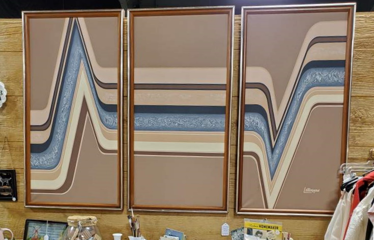

It’s not often you find oil paintings with such a well-defined and readable signature, but the one on this triptych we have in our booth at Fargo Antiques and Repurposed Market is clearly LETTERMAN, stylized with extended letters to evoke modernity and motion.

And, not only is the name so readable, the signature readily identifies a variety of other works from this artist, all large, geometric paintings, all with the same readily-identifiable signature.
Don’t try to find “Letterman”, though: this isn’t an artist’s signature, it’s the name of a line of high-end decorator art sold in department stores, particularly JC Penney’s, during the 1970s, sourced and distributed by Artmaster Studios of California. A few are attributed to an Antoinette Letterman but I believe these are misattribution to the wrong “Letterman”; Antoinette’s signature looks less like a logo and more like a human signature from the examples I can find.
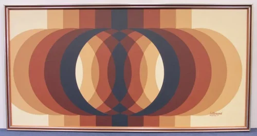
The paintings, all done with quality higher than the usual starving artist works you find prescribed by interior designers, appear to be unique, even if there are similarities in styles. Paintings range from very geometric to realistic photos of animals. They mostly share a common palette, primarily browns and yellows and neutral colors.
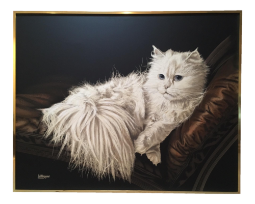
Unlike a lot of decorator art, the unique and stylized art produced under the Letterman logo demand a high price today. Collectors recognize the uniqueness of the style, and are willing to pay high prices for these rare works of art.
Leave a Reply